
Looking for inspiration for your Magento theme design? We’ve shared three of our favourite designs from some of Magento’s biggest clients below.
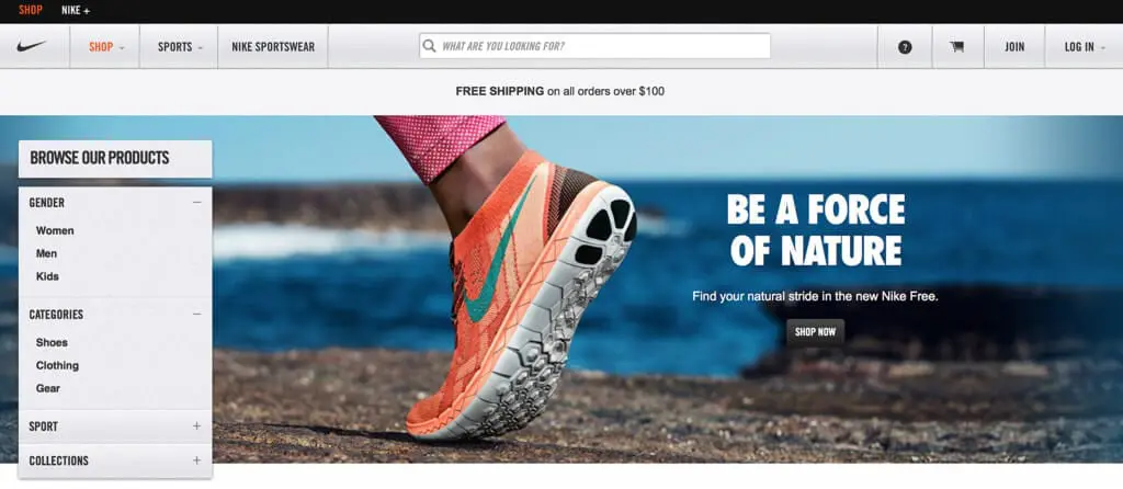
http://www.nikestore.com.au uses large images as part of its Magento design to show off its products in great detail.
Visual appeal
When designing your Magento eCommerce site, it’s important to look at it as a customer. What would make you want to stay on the page and make a purchase? Visual appeal is a crucial part of Magento design. We believe Nike, a company that uses Magento, has got it spot on with their large, colourful images that draw visitors in and entice them to shop for their items.
What’s also great about the Nike Magento site is that users can simply search for the product they want using the search bar at the top. Alternatively, they can navigate to the products they are interesting using the simply navigation bar on the left. The design is very user-friendly and allows for an enjoyable shopping experience.
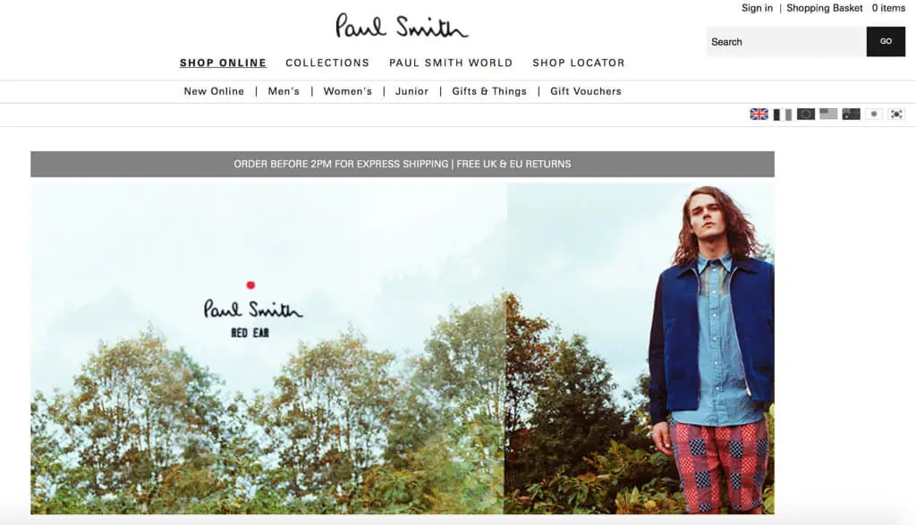
http://www.paulsmith.co.uk/uk-en/shop/ has a clean-cut design that gives it a high end, professional feel.
White space
As experienced Magento designers, we are always teaching our clients about the importance of white space in web design. The truth is that you don’t have to fill every inch of screen space with an image, offer or text. Using white space around your content can let it breath and make it easier for visitors to engage with it.
We love how Paul Smith has used white space in their Magento design. Your eyes are immediately drawn to the colourful slideshow images in the centre and it has a lovely clean-cut feel. All of the navigation links you need are neatly organised at the top of the page, making shopping the website a breeze.
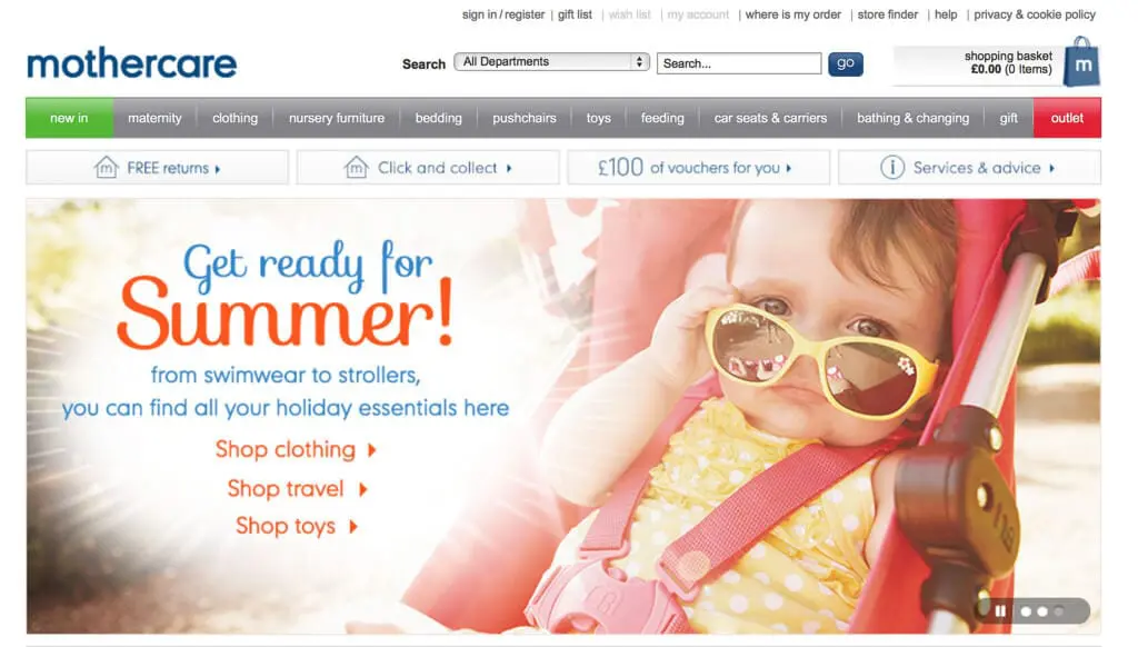
Mothercare is powered by Magento
Strong calls to action
When it comes to designing your Magento eCommerce site and organising its content, you need to think about what you want customers to see on the homepage. Using images and text with a strong call to action is great for directing customers to the parts of your website that make the most conversions.
For example, if you had a sale on, you could use a big banner on the homepage to advertise it to customers, with a call to action telling them to shop the sale now. Alternatively, if you were promoting a new range of products, you could feature them on your homepage, with a call to action telling customers to check out your latest collection and even offer a discount as an incentive to make a purchase.
The thing we love most about the Mothercare Magento website is its image slider. Each image is really colourful and attractive and features text that informs customers about the latest sales, offers and collections. The calls to action are strong and come with links to make navigation simple.
We hope these website examples and Magento design considerations have helped you come up with ideas for your own eCommerce store design. For further assistance, check out our Magento Design Guide or get in touch with the Magento eCommerce Agency. You can also visit our page ‘where to get free Magento responsive themes’ for more ideas.
A selection of our older posts, written by various members of the team between 2015 to 2021.


0 Comments