
With more and more people shopping online using there smartphones and tablets, there has never been a better time to invest in a mobile friendly design. Whilst building a separate mobile website is one option, the better option is to invest in a responsive web design. Here we’ve provided a quick guide outlining the topic of what is responsive design and its benefits.
Magento Responsive Web Design
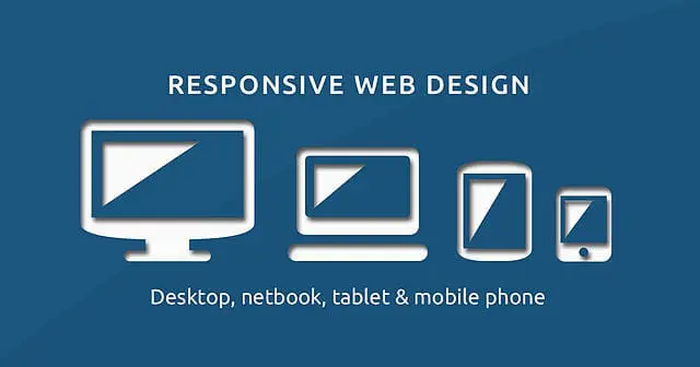
About responsive web design
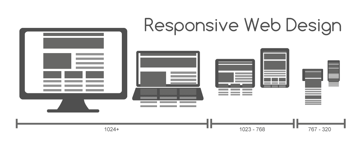
Unlike your average web design, a responsive web design can adapt to the device it is being viewed on. Responsive web designs are built with clever code that can identify whether they are being viewed on a PC, laptop, smartphone or tablet and adjust to offer the best possible viewing experience for the user.
One of the great things about responsive design is that it prevents businesses from having to build multiple websites for each device. They can simply invest in a single responsive web design and benefit from a site that is compatible with all devices from PCs to smartphones.
Video source: https://www.youtube.com/watch?v=CcU8sNX3ees
Increase conversions
Responsive web designs offer a fantastic viewing experience across all devices, ensuring customers can quickly find the products they need and read the content with ease. Offering a great user experience will help you to keep customers on your website and increase the chances of them converting. The more conversions you get, the more money you make, so it’s well worth investing in a responsive web design for Magento.
Make your life easier
Responsive design won’t just benefit your customers. It can also benefit you too, in terms of saving you time and resources. Maintaining a single site, rather than multiple sites will be far less effort. You won’t have to worry about things like duplicate content, as it’ll be all on one URL and you can upload content once, knowing that it will be available to customers whether they’re viewing your site on their PC, mobile or tablet.
We specialise in creating responsive web designs for the Magento ecommerce platform.
Magento SEO benefits
If you’ve read our Magento SEO tips, you’ll know just how important user experience is to your search rankings. The better user experience you offer, the more likely you are to rank highly for your keywords. As we mentioned before, responsive web design is great for improving user experience and is therefore great for improving your search rankings too. It will also help to speed up page loading times on mobile devices and keep your bounce rate low – something else which will contribute to your Magento site’s SEO.
Benefit from the new Google algorithm
On 21st April 2015, Google launched a new search engine algorithm designed to benefit mobile friendly websites. Use a responsive design for your Magento eCommerce store and you will be able to benefit from increased rankings in Google’s mobile searches. Whilst Google is only elevating the rankings of responsive websites in its mobile searches for now, it is obvious that the search engine values the importance of mobile friendliness, so there’s a possibility it might affect desktop searches in the future too.
Finding responsive Magento themes
If you are looking for a responsive Magento theme, head to the Magento Connect store where you will find a number of different options to choose from. Alternatively, you can have a responsive design built from scratch by a Magento developer. This will cost more than using a pre-made responsive theme; however you will be able to benefit from exclusivity and uniqueness. See our page titled ‘Where to get free Magento responsive themes’ for more information.
Conclusion
If you want to make a good impression on your customers, increase your conversions and benefit from high search rankings, then you need a responsive design for Magento. See our Magento Design Guide for more information or contact the Magento eCommerce Agency to speak to a member of our team.
Image credits: Muhammad Rafizeldi and Rafizeldi
A selection of our older posts, written by various members of the team between 2015 to 2021.


0 Comments